§ Brand — Specimen · g-e-n
G-E-N
元
The root. The origin. The first breath of a form.
窯元 × 宮下将太
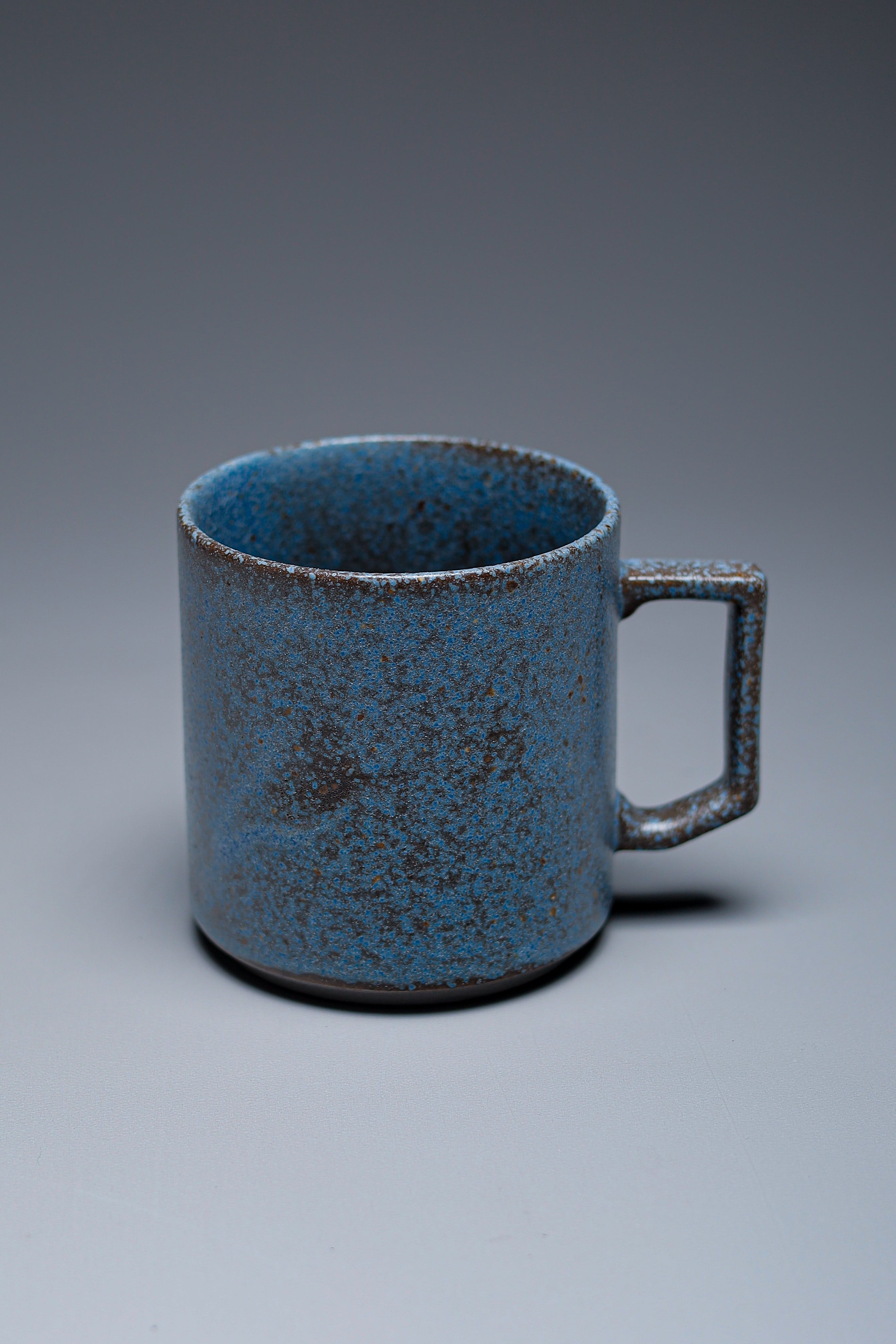
Fig. I — G-E-N stackable mug -ancient blue- / 窯元 × 宮下将太
§ I — Concept · Ph-01
Brand philosophy.
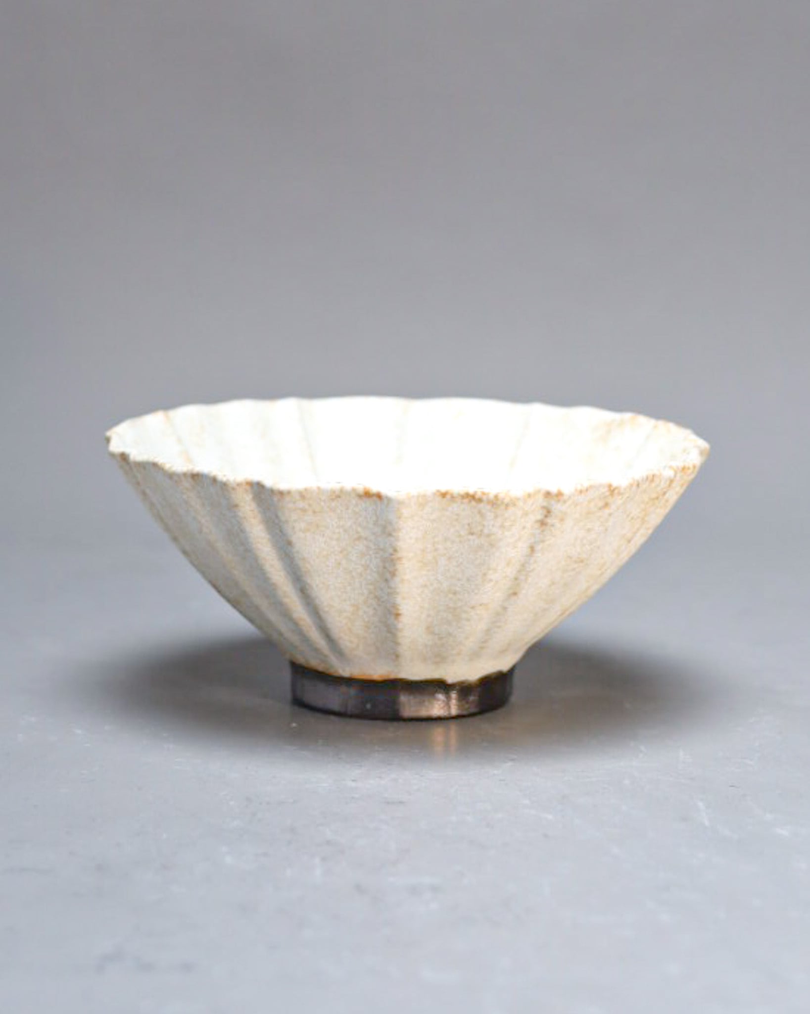
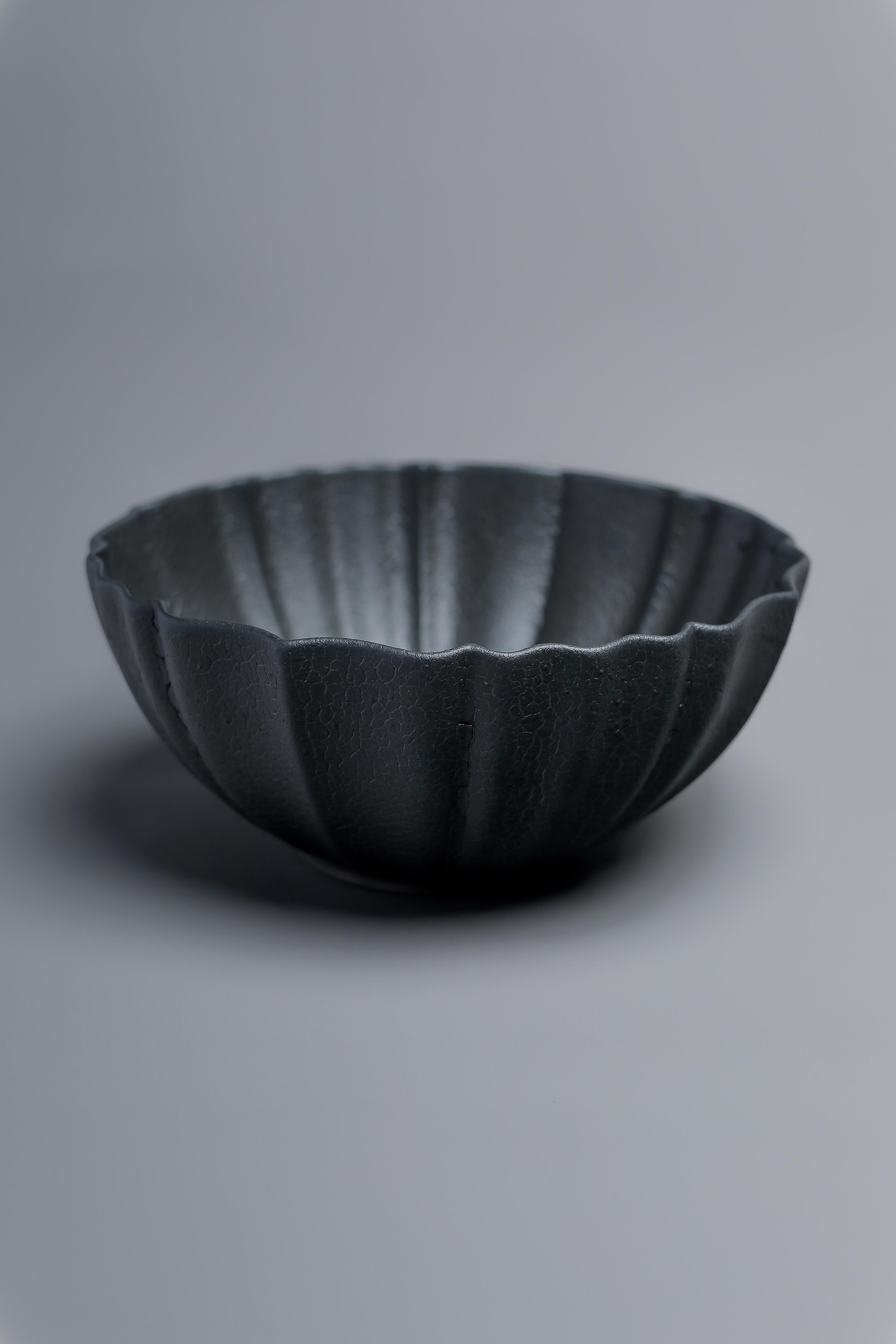
G-E-N is a project that bridges artists and industry, bringing a new register of value to Mino-yaki. By compounding the mass-production craft long cultivated in Mino with the identity of individual ceramicists, the brand was launched as a hybrid where creativity and function meet in chemical reaction.
Each piece begins from a traditional Mino bisque body, layered with the hand of a ceramicist. A new form of Mino ware in which function and aesthetic sense coexist — an attempt that starts by returning to the "root" (gen) of making itself.
“Factory hands and an artist's hand, in the same vessel.”
§ II — Partnership · Mk-04
The makers.
G-E-N is a brand built on the concept of "kiln × artist." We layer the bodies that Mino-yaki kilns have refined over generations of mass production with Shota Miyashita's glazes and motifs — letting two crafts cross to produce vessels for the contemporary table.
The collaborating kilns include a century-old cup-specialist pottery in Toki, Gifu, and a third-generation slip-casting factory. The dimensional sense and process design each has accumulated over decades is translated into a single line drawn by the artist.
Their guiding principle: "the proportions of restaurant tableware make food look its best, so household pieces should keep the same scale." Carrying the dimensions borrowed from a professional kitchen onto the home table — this is the measuring stick by which G-E-N's forms are made.
§ III — Iconography · Ic-α
Marks of meaning.
Traditional motifs and the meanings carried within these designs.
N° 01
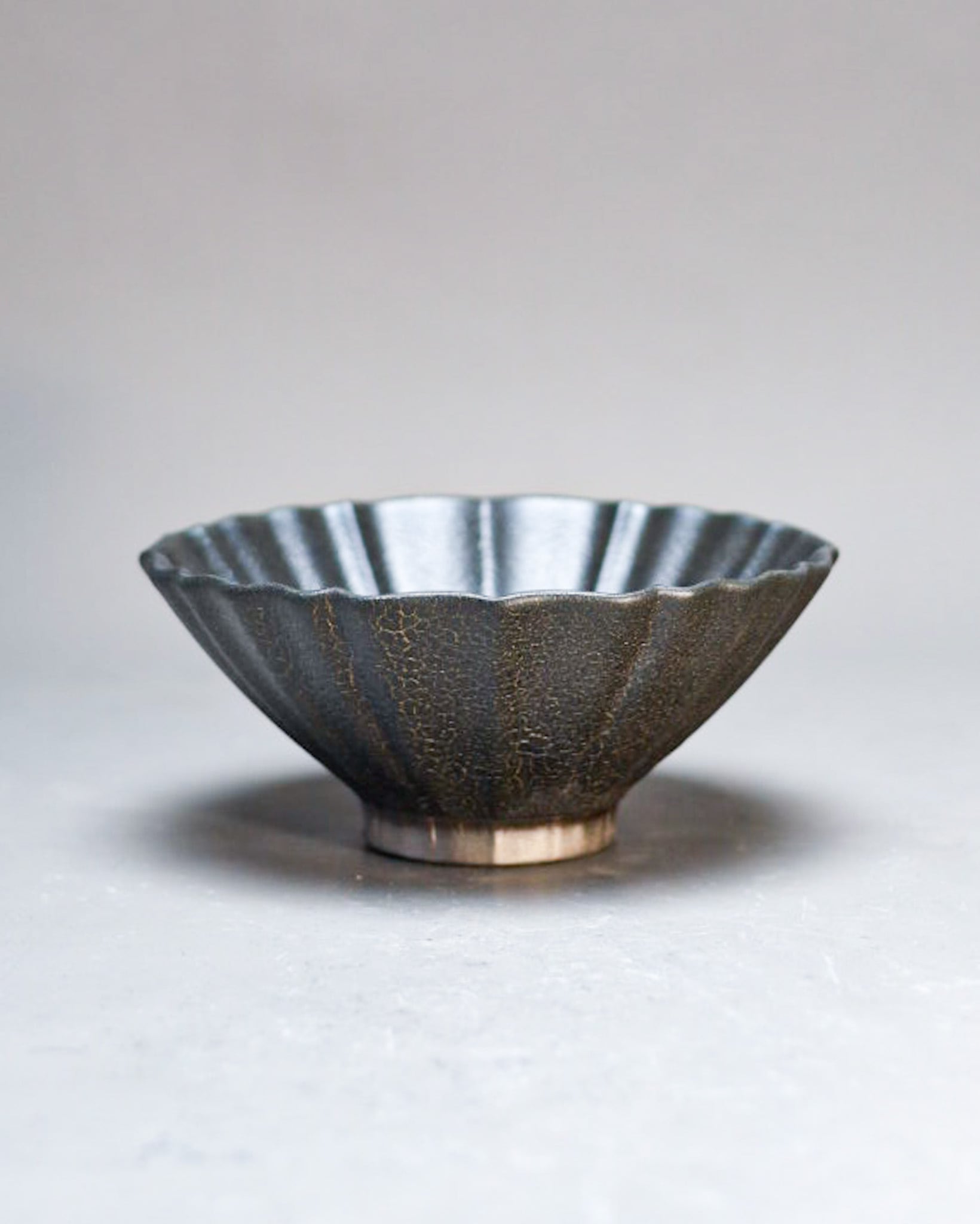
Lotus
LOTUS is, as the name implies, the image of a lotus leaf and flower — the oval form is the leaf, the round form is the flower. Deliberately not made as a rimmed plate but with depth, it became a dual-edged vessel that responds equally to Japanese and Western cuisine depending on the glaze (Riki Mizuno × Shota Miyashita).
N° 02
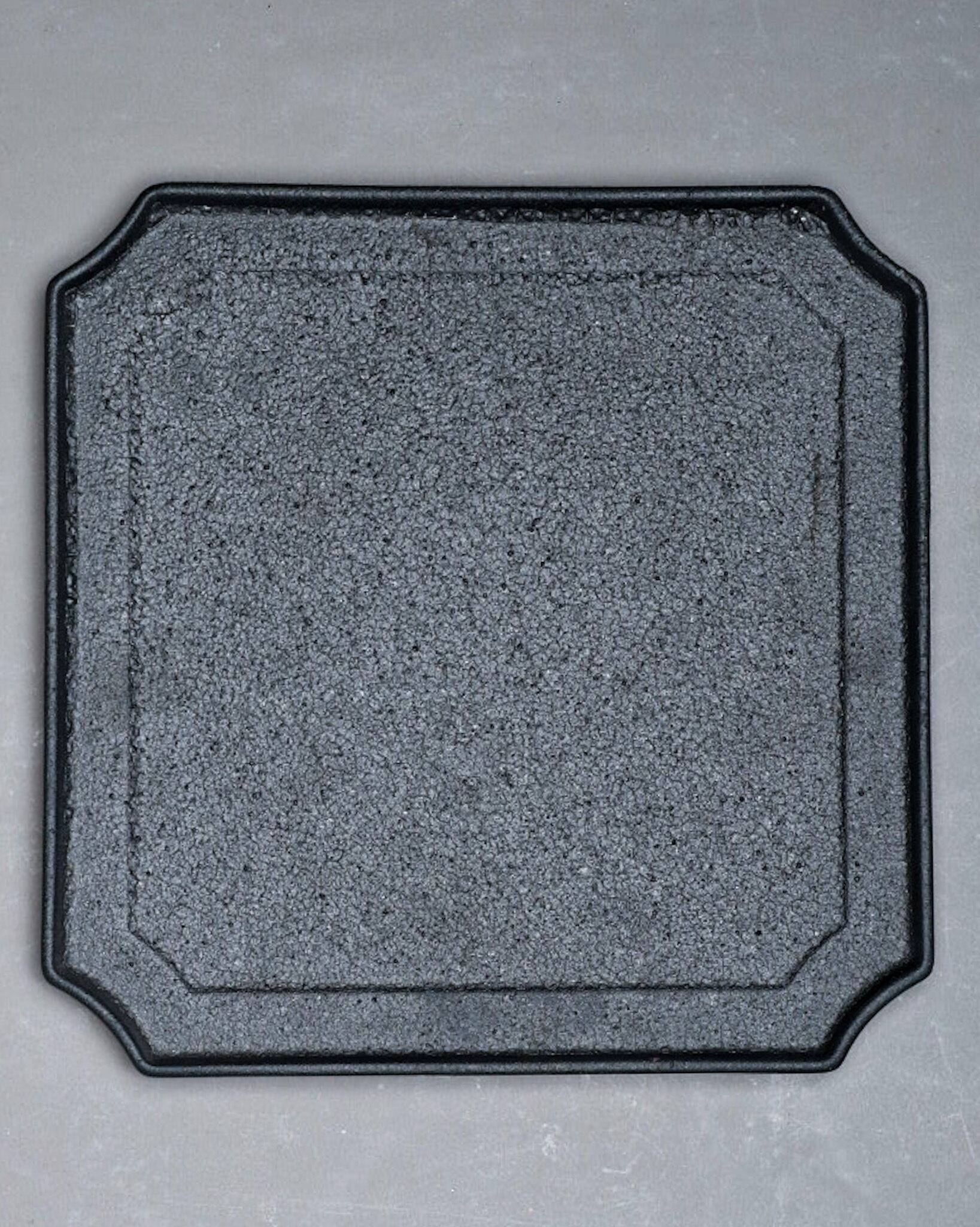
Sumikiri
A traditional motif in which the corners are cut away. The flat shape opens up the range of plating, while the cut corners give an accent that a pure square would not. A single relief step within the surface frames the food as if placing it inside a picture mount. Being a traditional form, it sits naturally on a celebratory table.
N° 03
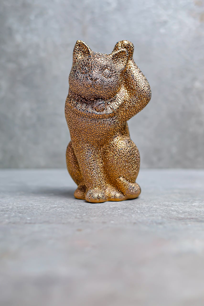
Manekineko
A reinterpretation of the fortune-beckoning charm through mass-production craft and an artist's design — a manekineko sized for a contemporary tabletop.
§ Series — Idx-4
Series index.
A dictionary of series within G-E-N.
- N° 01
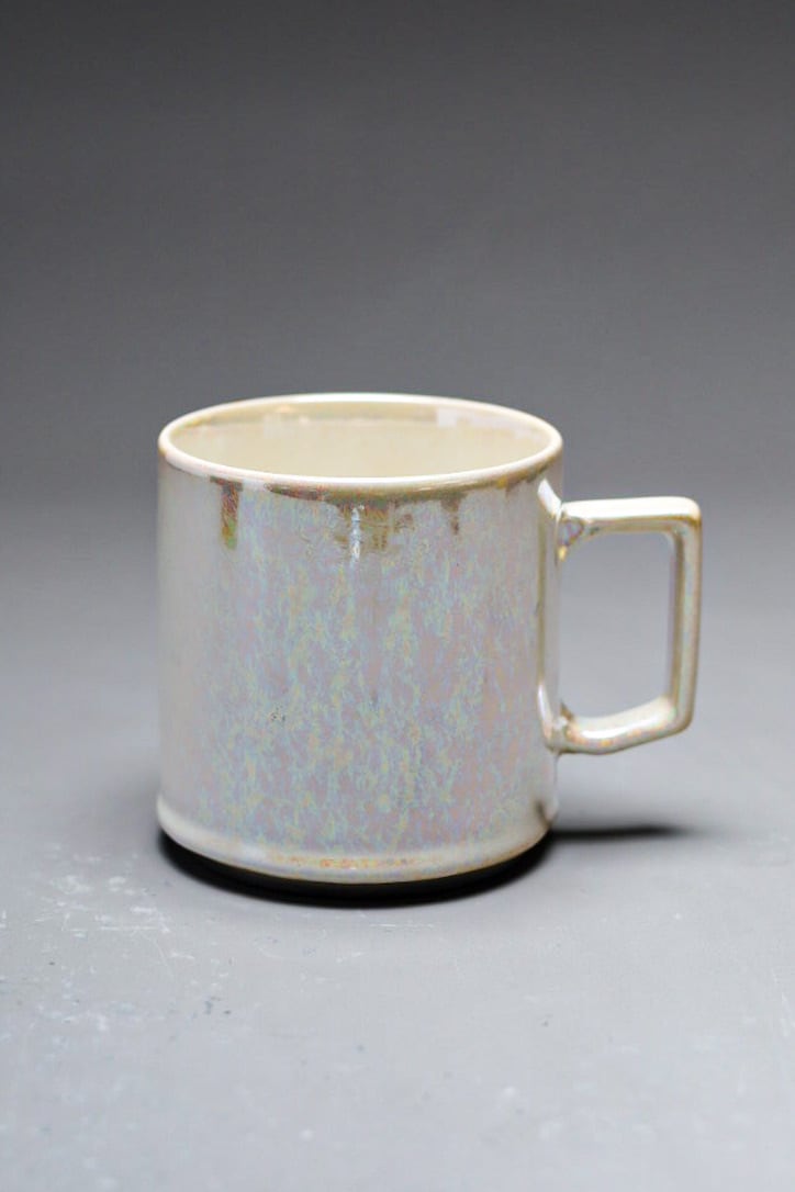
MUG
stackable mug — A century-old pottery's form, layered with an artist's glaze.
- N° 02
LOTUS
蓮 — A round plate with added depth — crossing Japanese and Western cuisine.
- N° 03
SUMIKIRI
隅切 — A square plate with cut corners — framing food like a mount.
- N° 04
MANEKINEKO
招き猫 — A fortune-beckoning charm scaled for the contemporary table.
§ Artists — Hd-1
The hands.
§ Products — Pr-52
From G-E-N.
52 pieces